The BCR
Duration
Tools
Type
Role
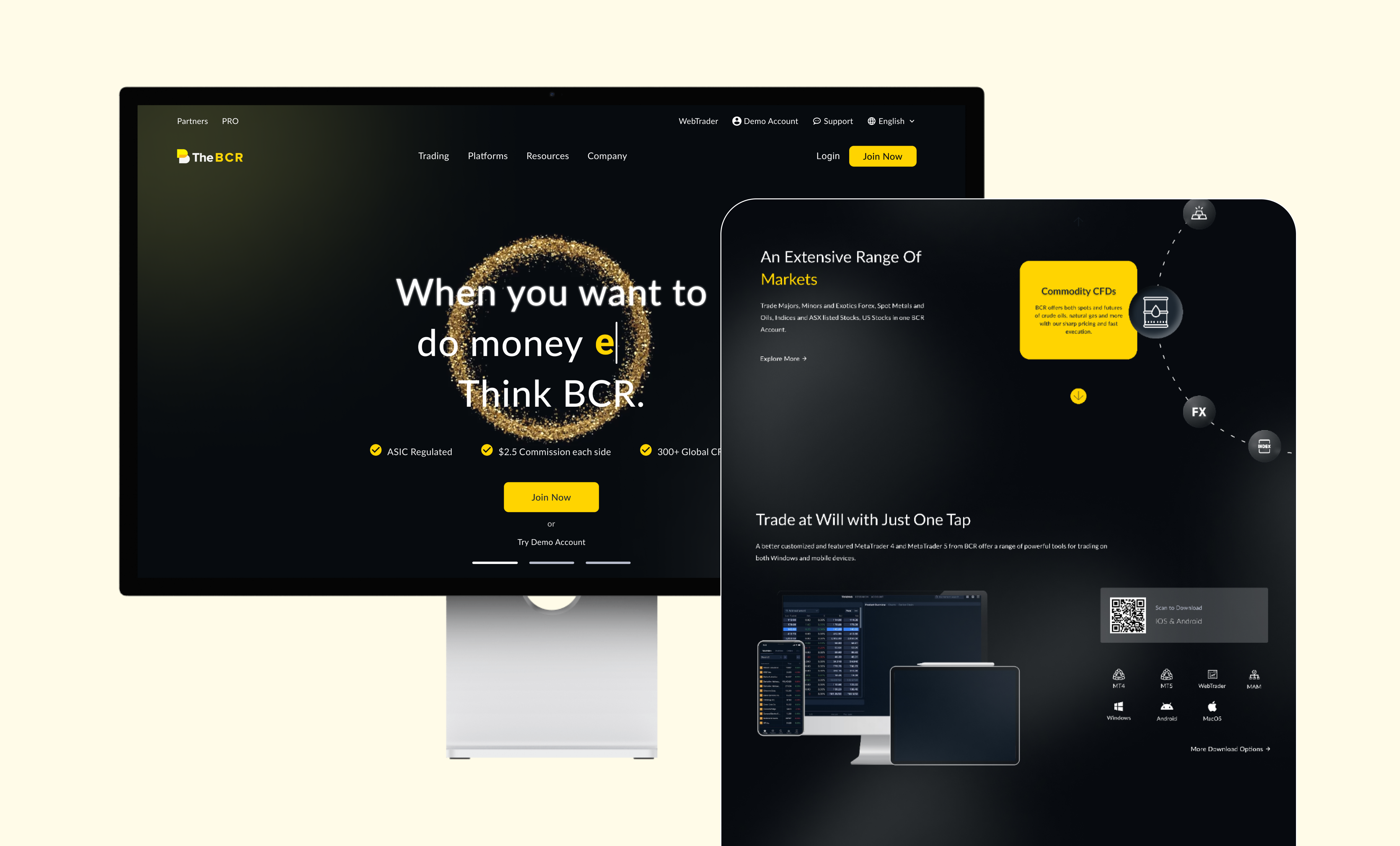
The BCR
Duration
Tools
Type
Role
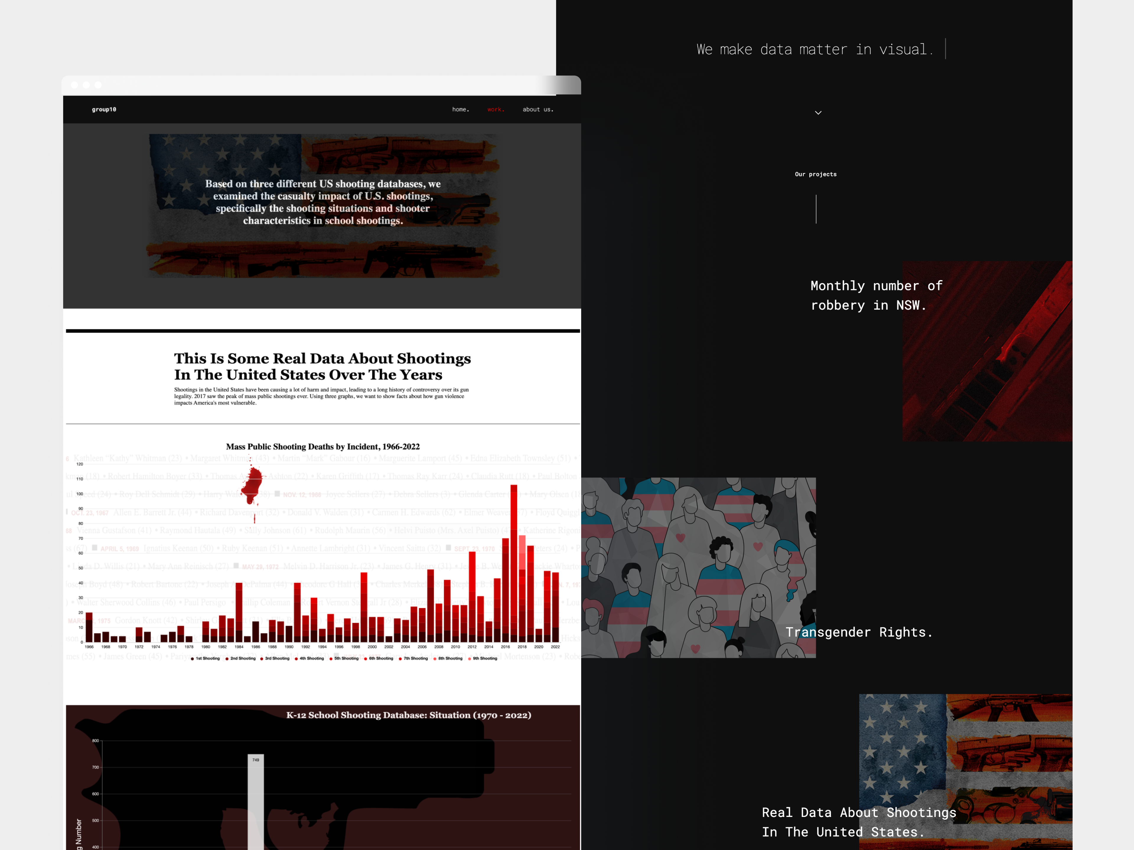
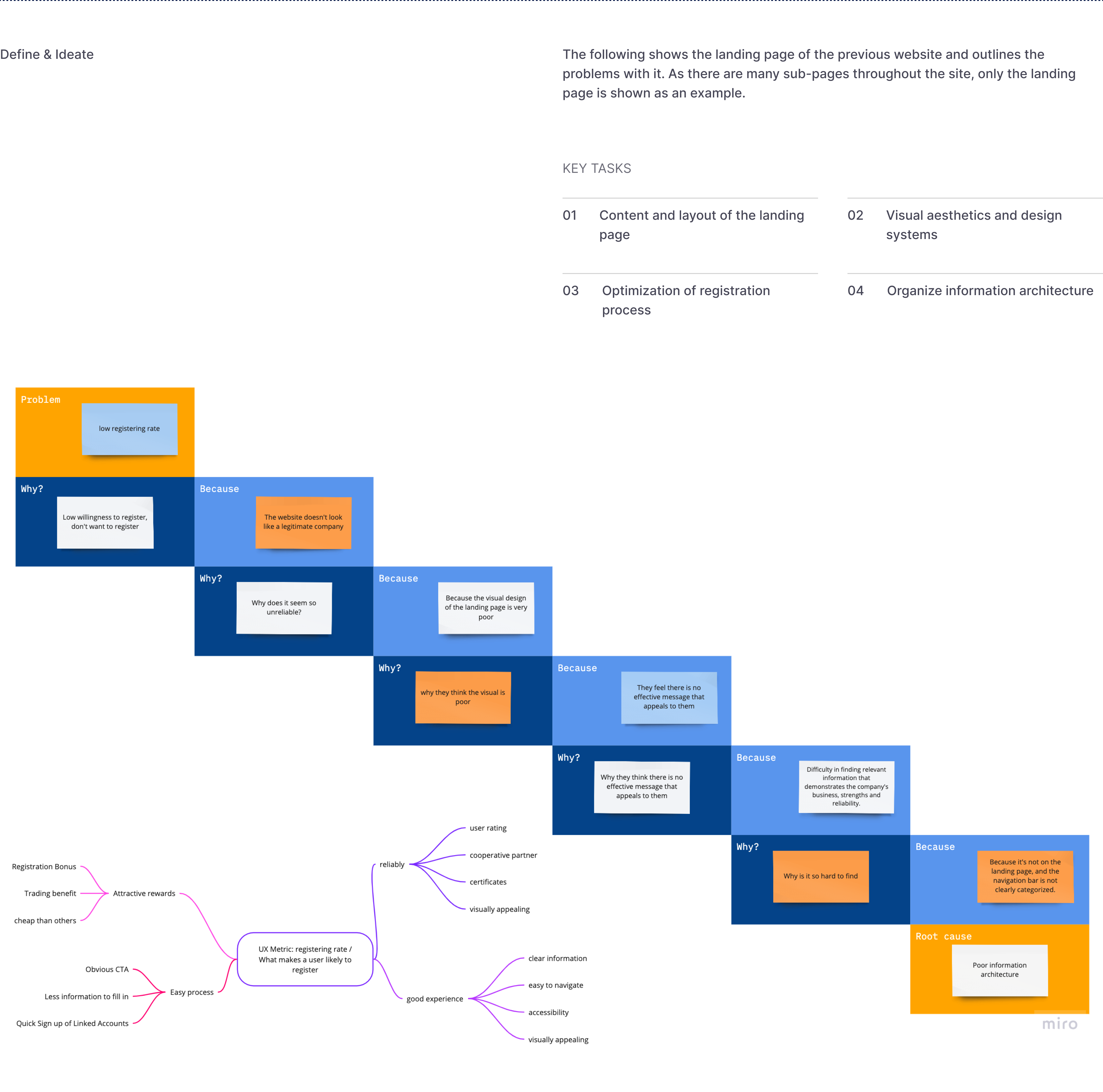
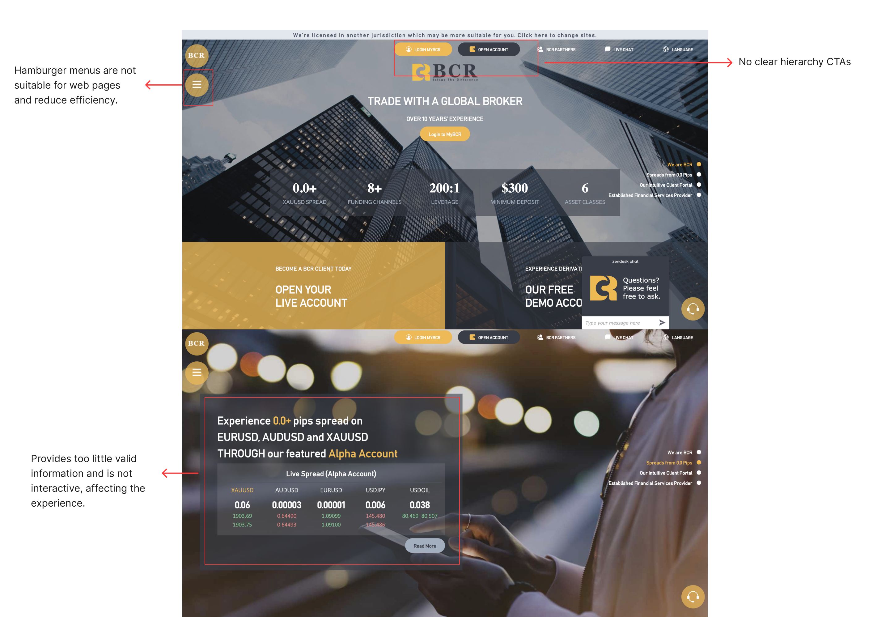
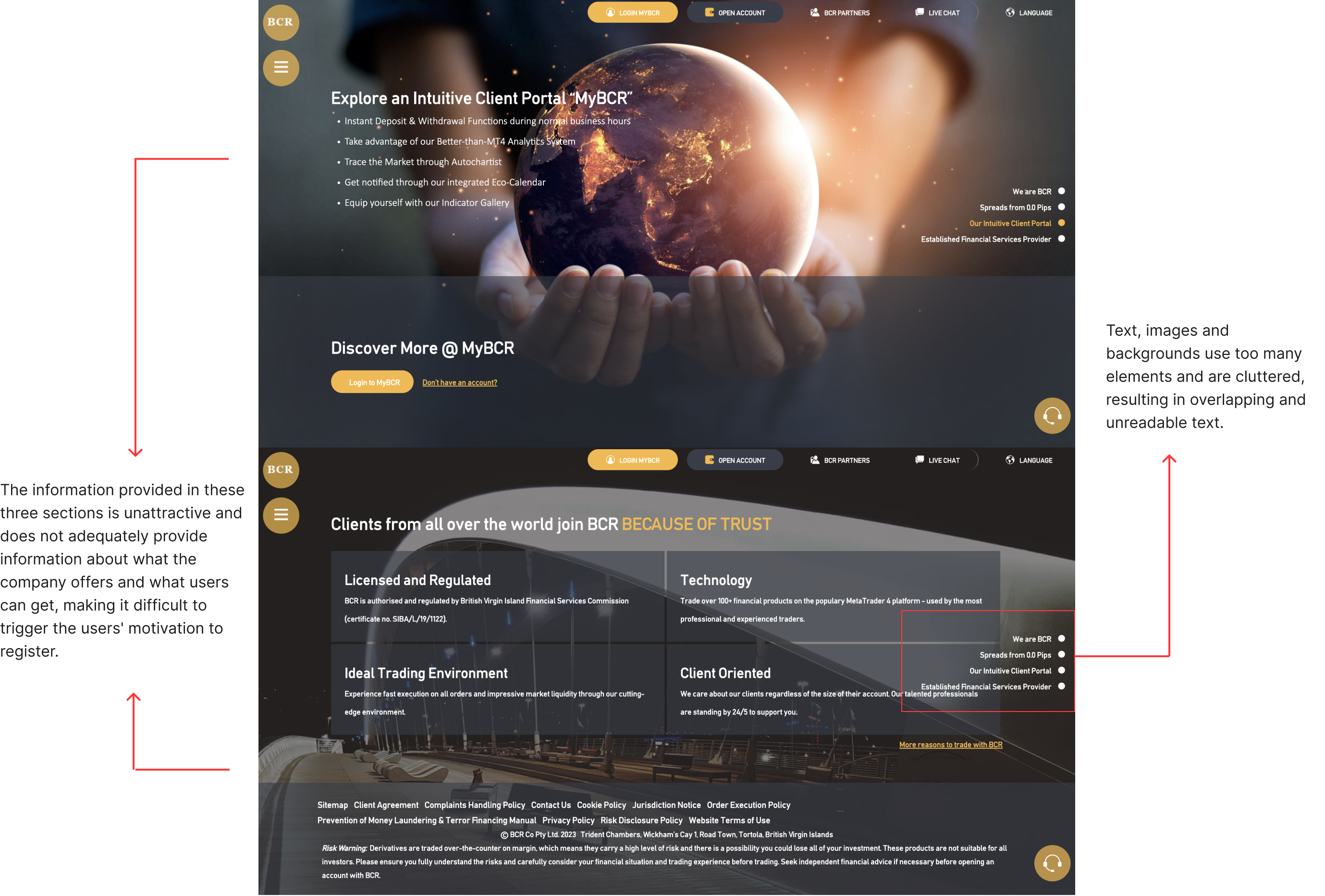
The project focuses on optimizing BCR's website to enhance the company's digital brand image and increase user registration conversions. The website is a vital online presence and promotional channel, but currently only 1% of users are registering from the web, with feedback including difficulty in finding information and doubts about professionalism. Our goal is to enhance brand professionalism, visual appeal, and user experience to improve user satisfaction and drive higher conversion rates.
Challenge
Using the "How Might We" method, I have analyzed the company's objectives and user pain points and distilled the following three key challenges:
- How Might We enhance the company's professional image and reduce user skepticism?
- How Might We improve users' accessibility to information and enhance their overall user experience?
- How Might We boost user registration rates?
Solution
In response to the aforementioned critical challenges, I've formulated the following UX-driven solutions:
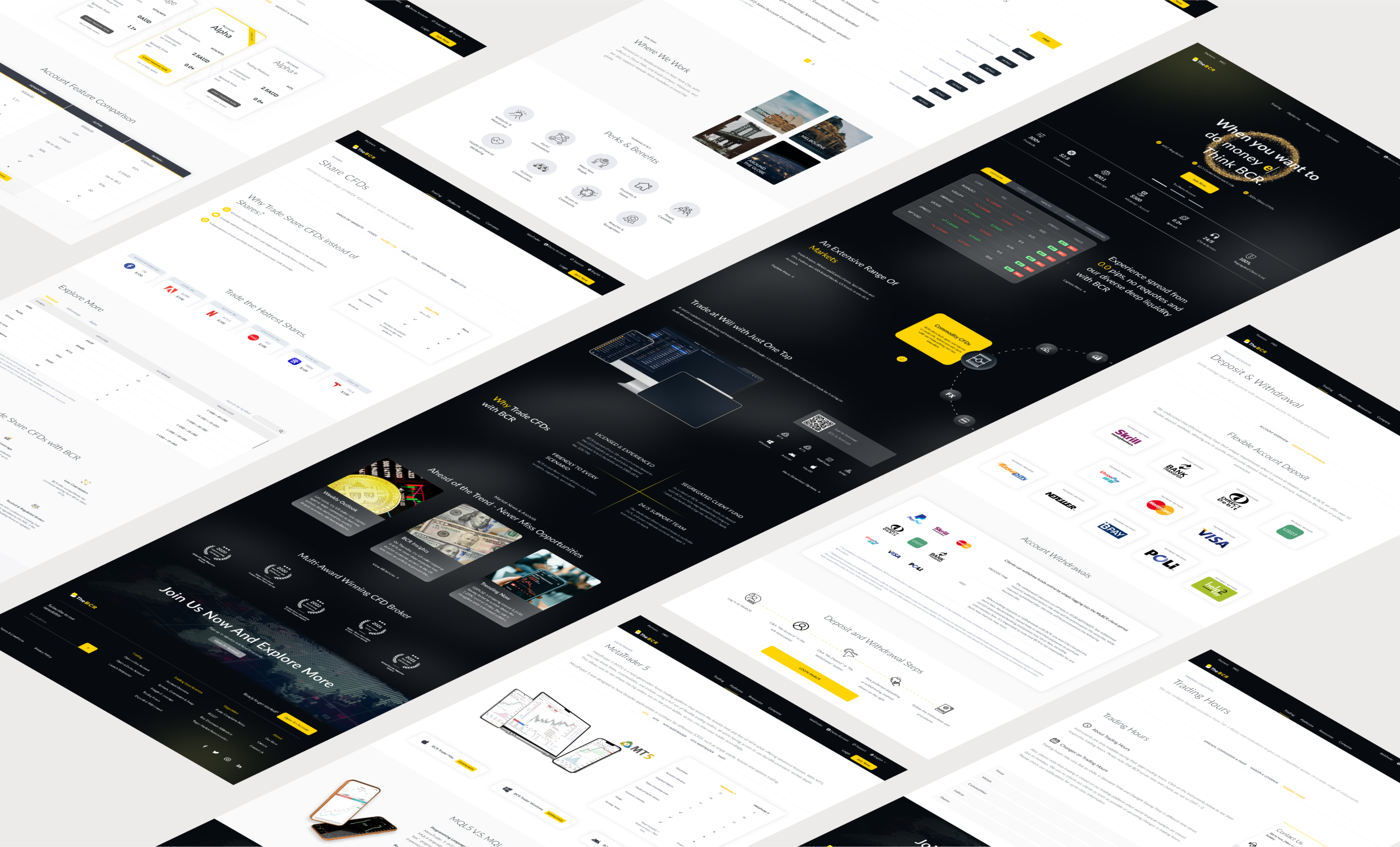
- Create a design system align with the company's brand to ensure visual uniformity. Craft visually enticing web designs in accordance with CFD industry standards.
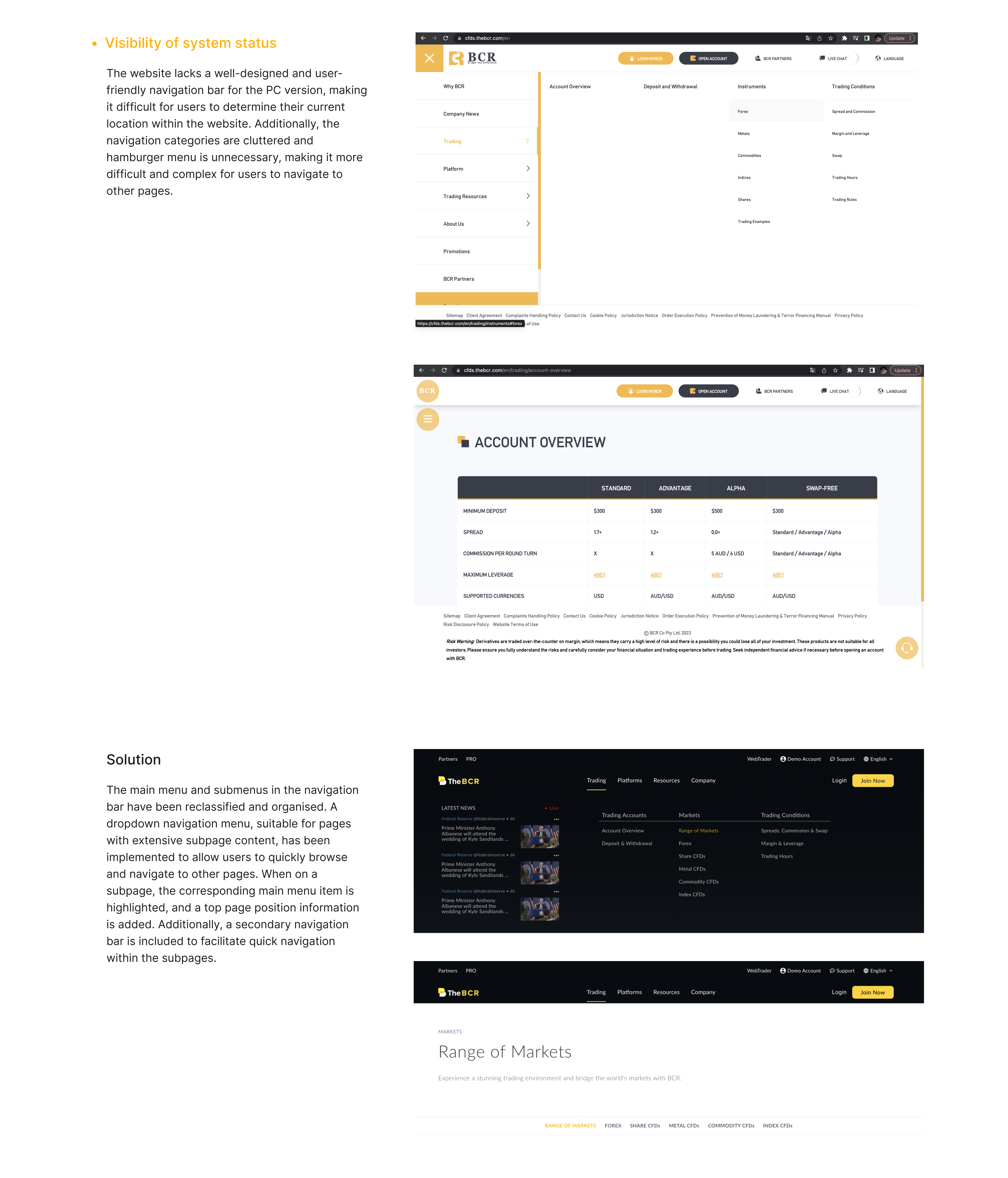
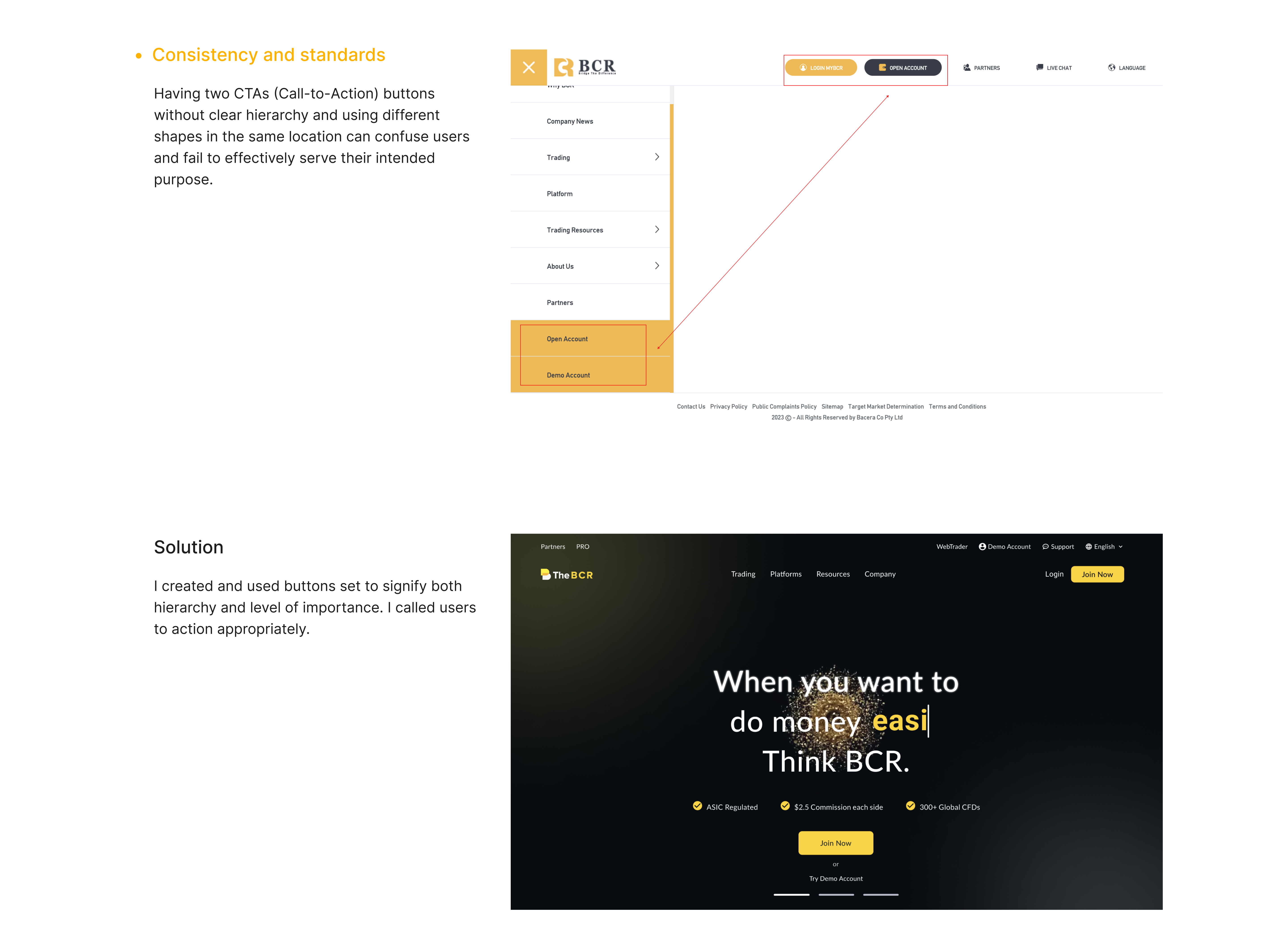
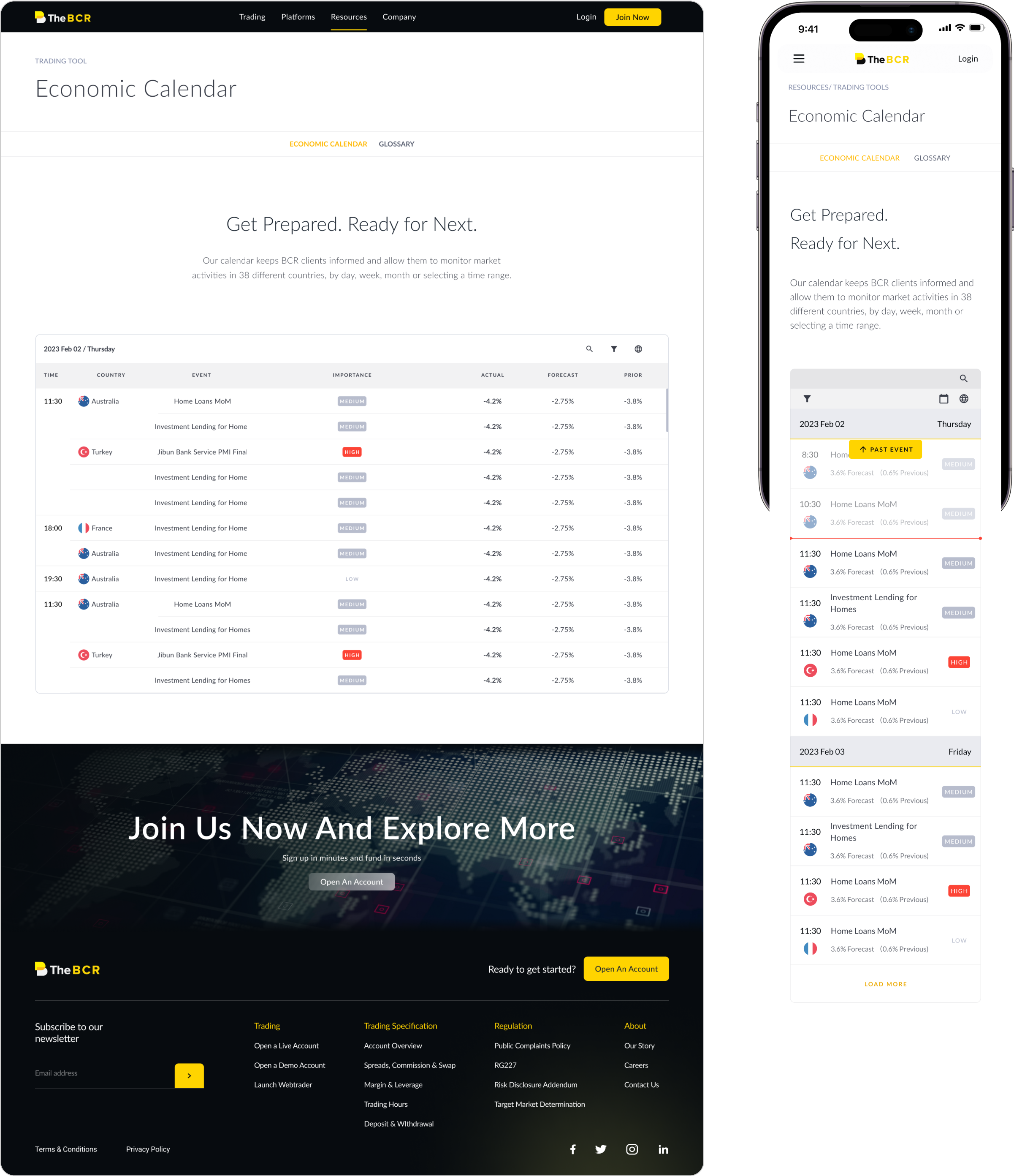
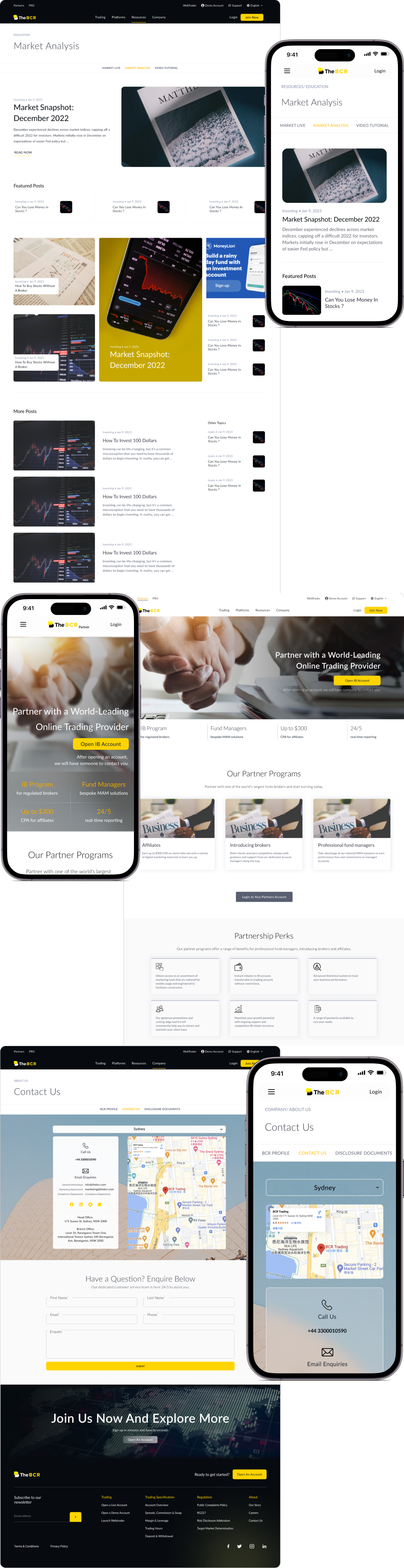
- Streamline the navigation bar and information architecture to facilitate users in locating essential information effortlessly, thus enriching usability and the user experience.
- Create a captivating landing page to entice users to linger longer and optimize the registration process by mitigating registration barriers.
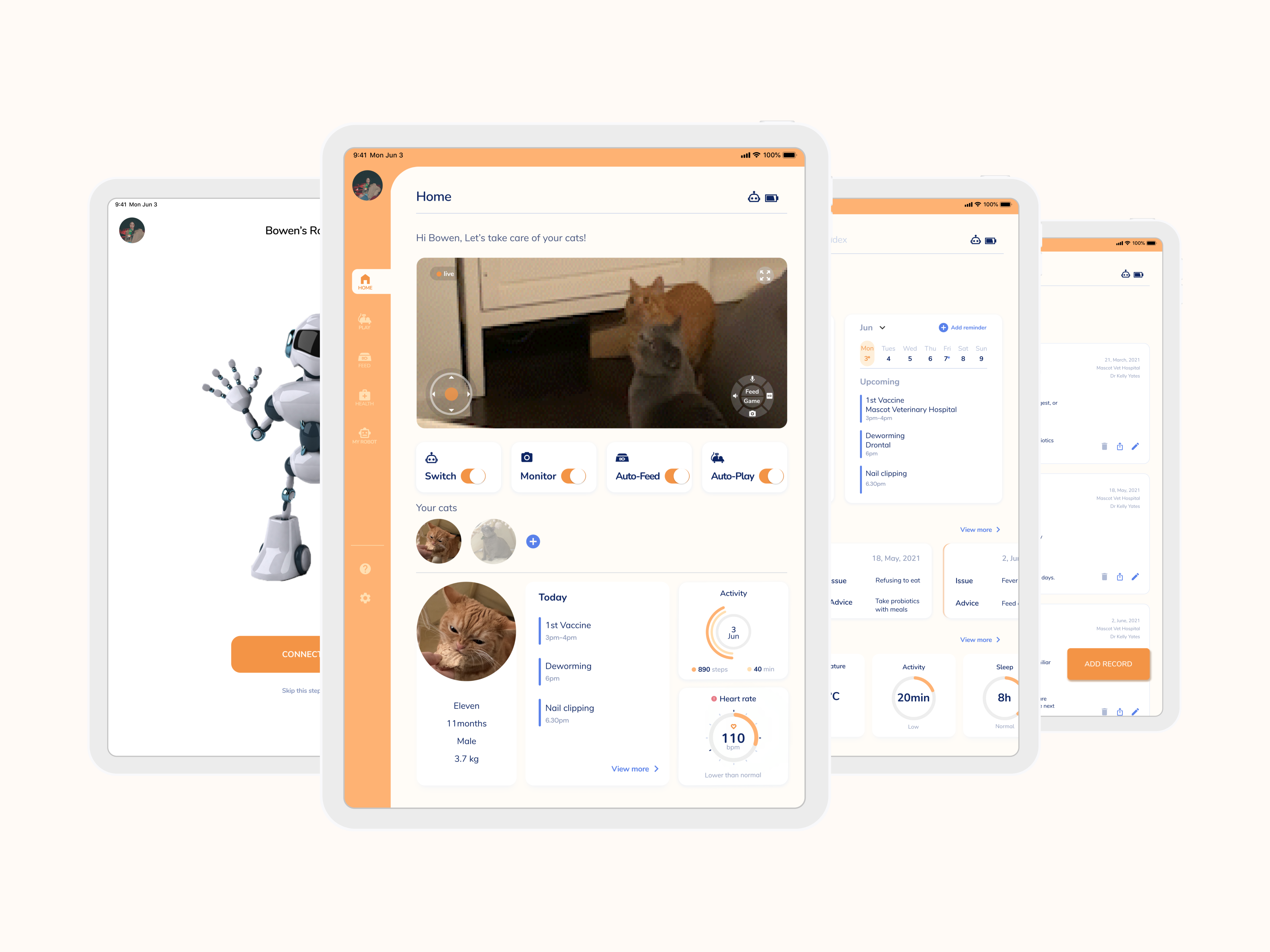
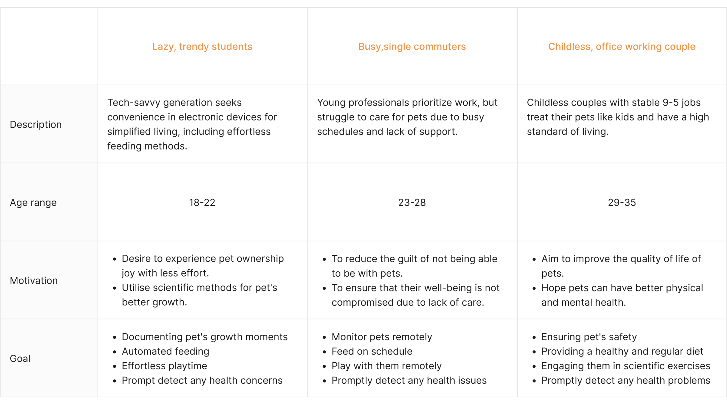
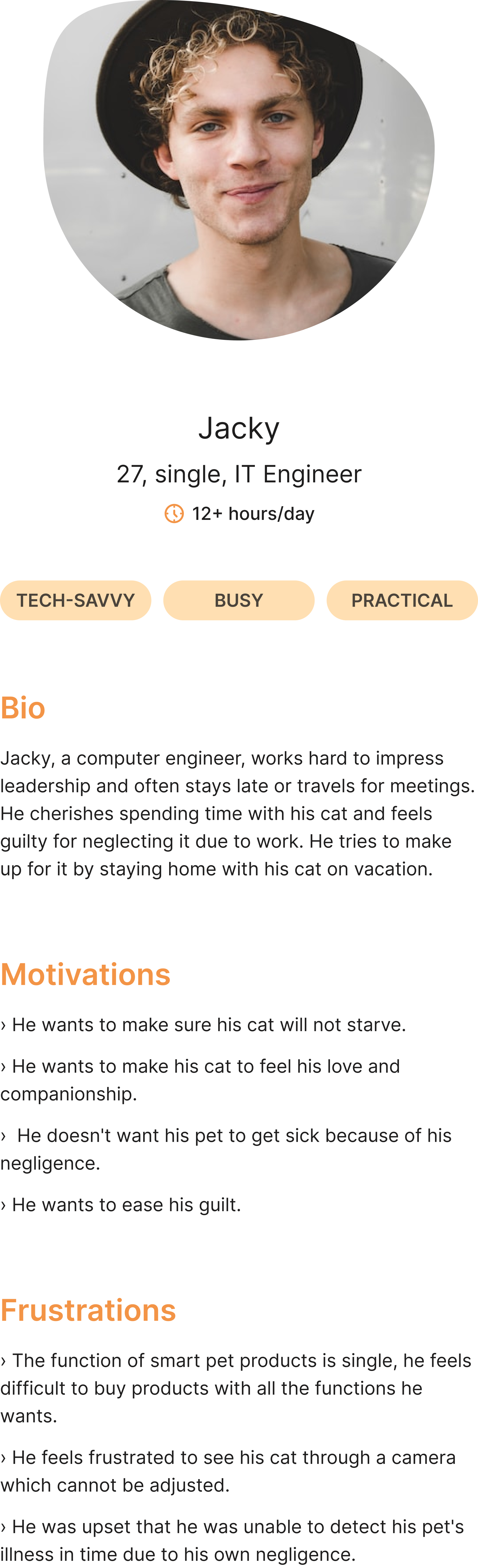
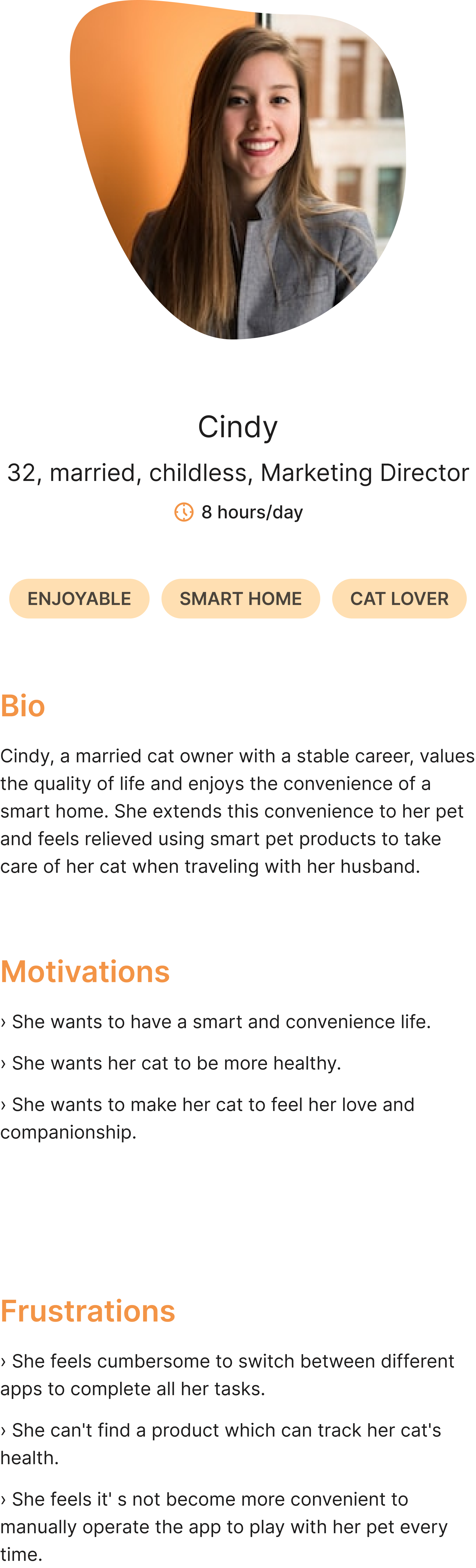
Discover
Pets keeping essentials
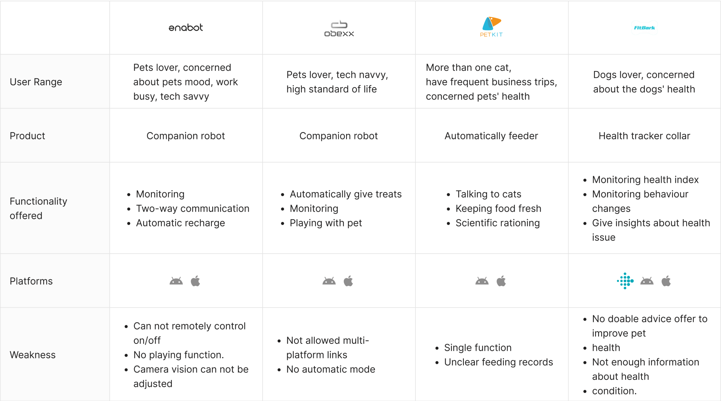
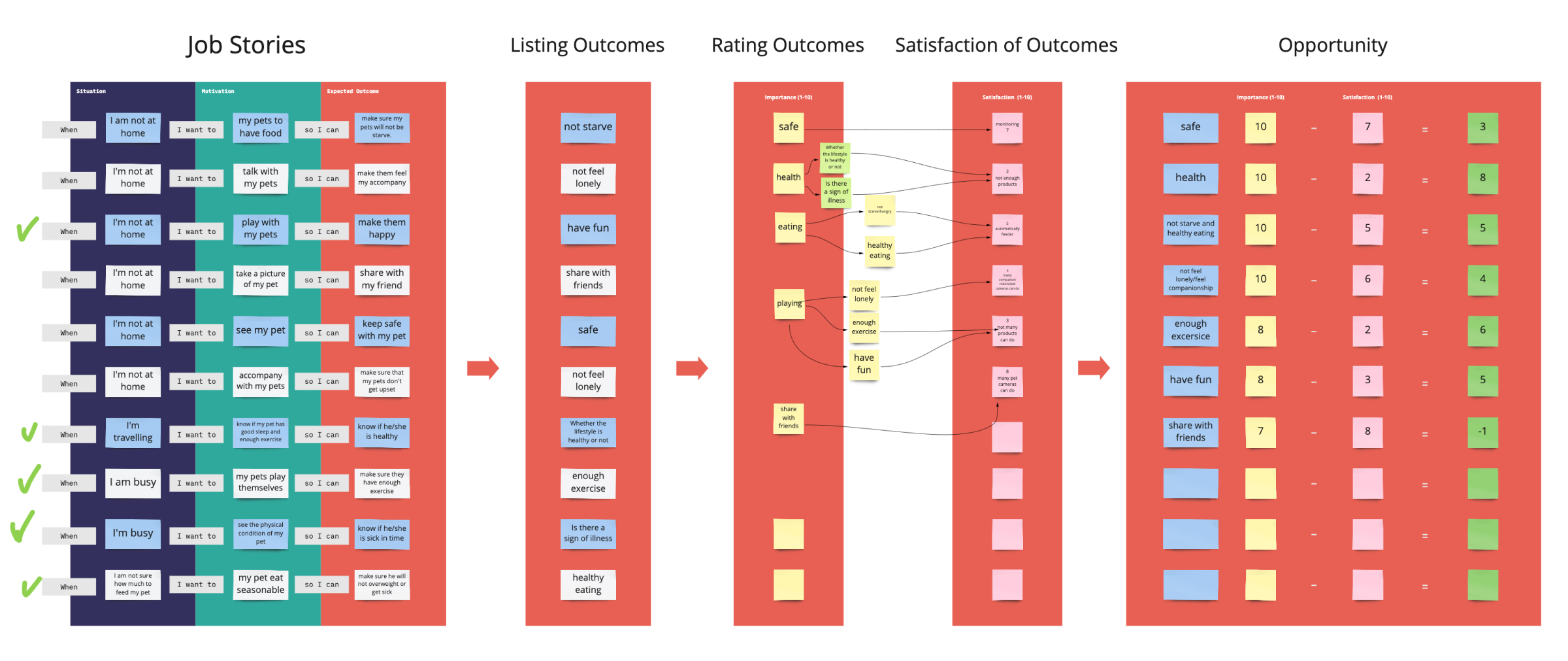
Define
Carving out a niche in an emerging market
Ideate
Focus on the health function
Test
Focus on the health function
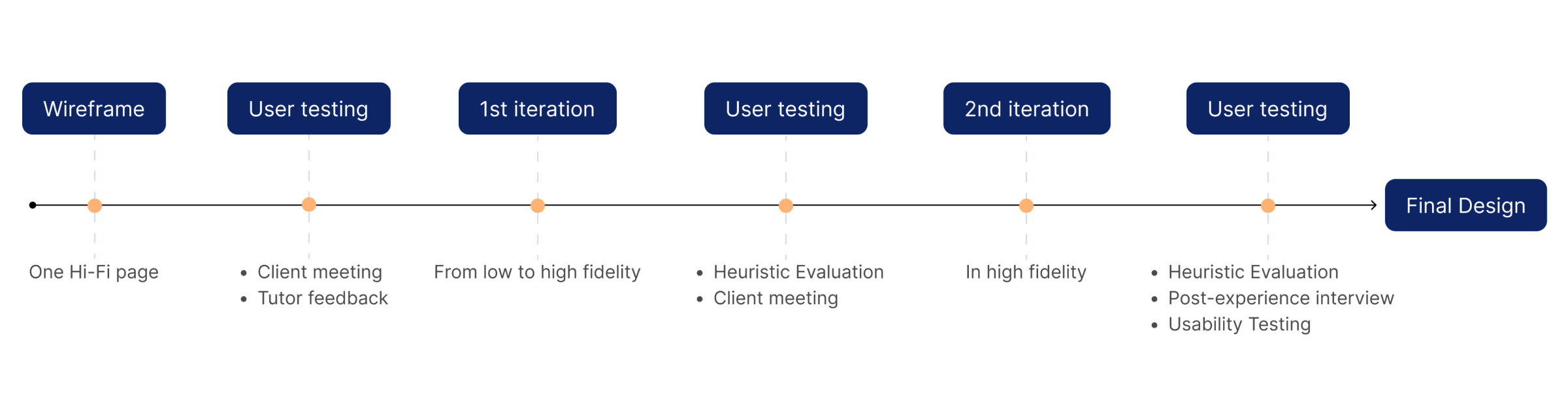
Design Process
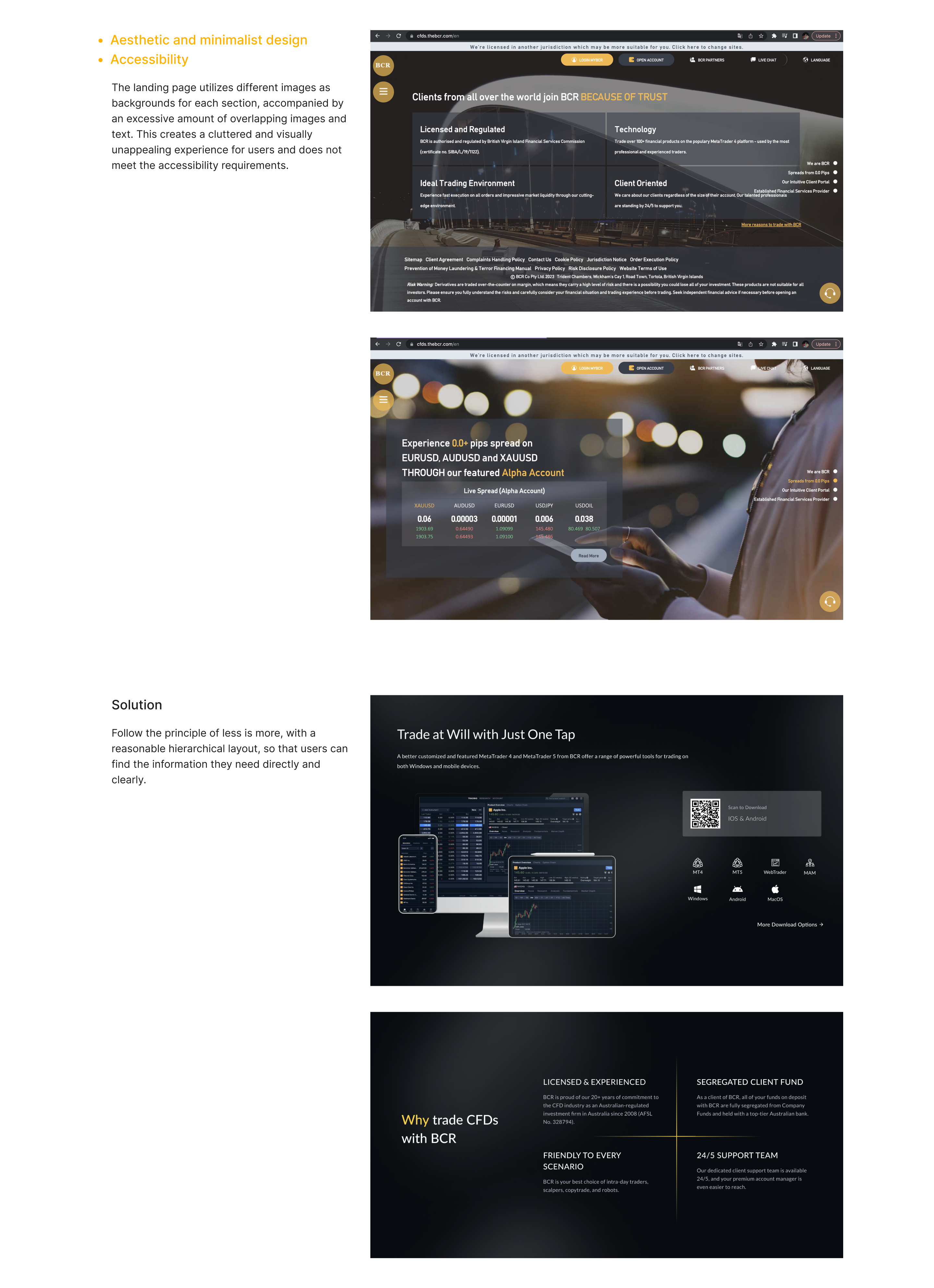
More professional and user-centric.


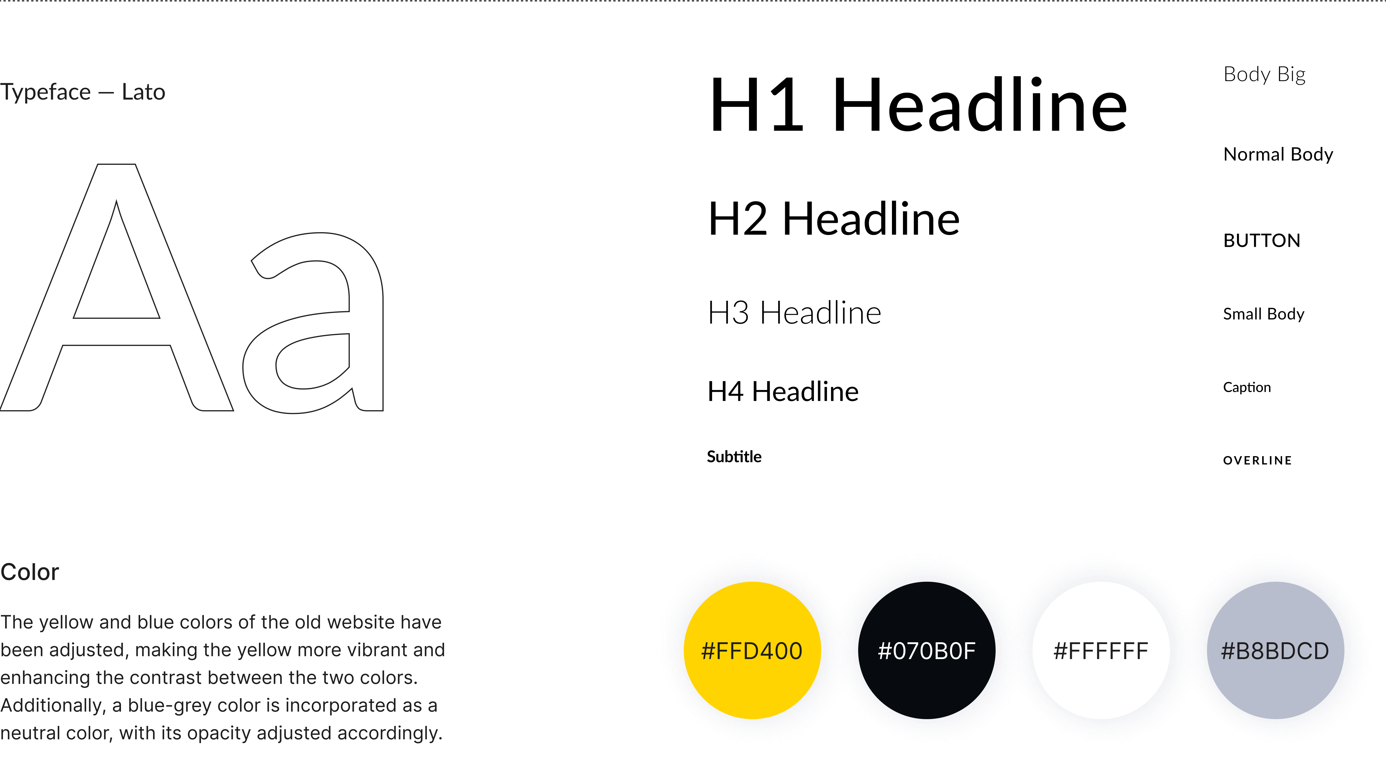
Typography & Color
Visual Design Choice
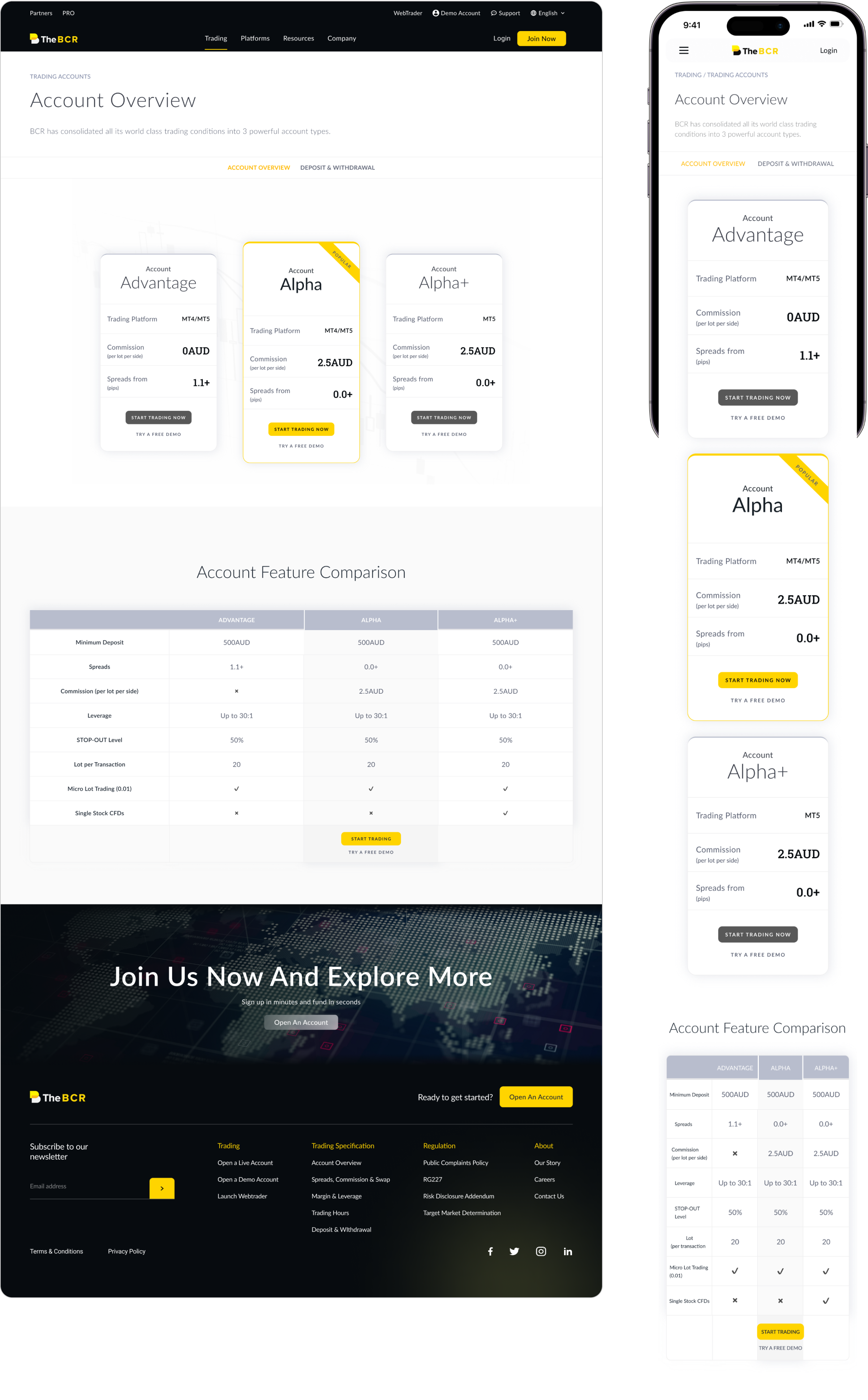
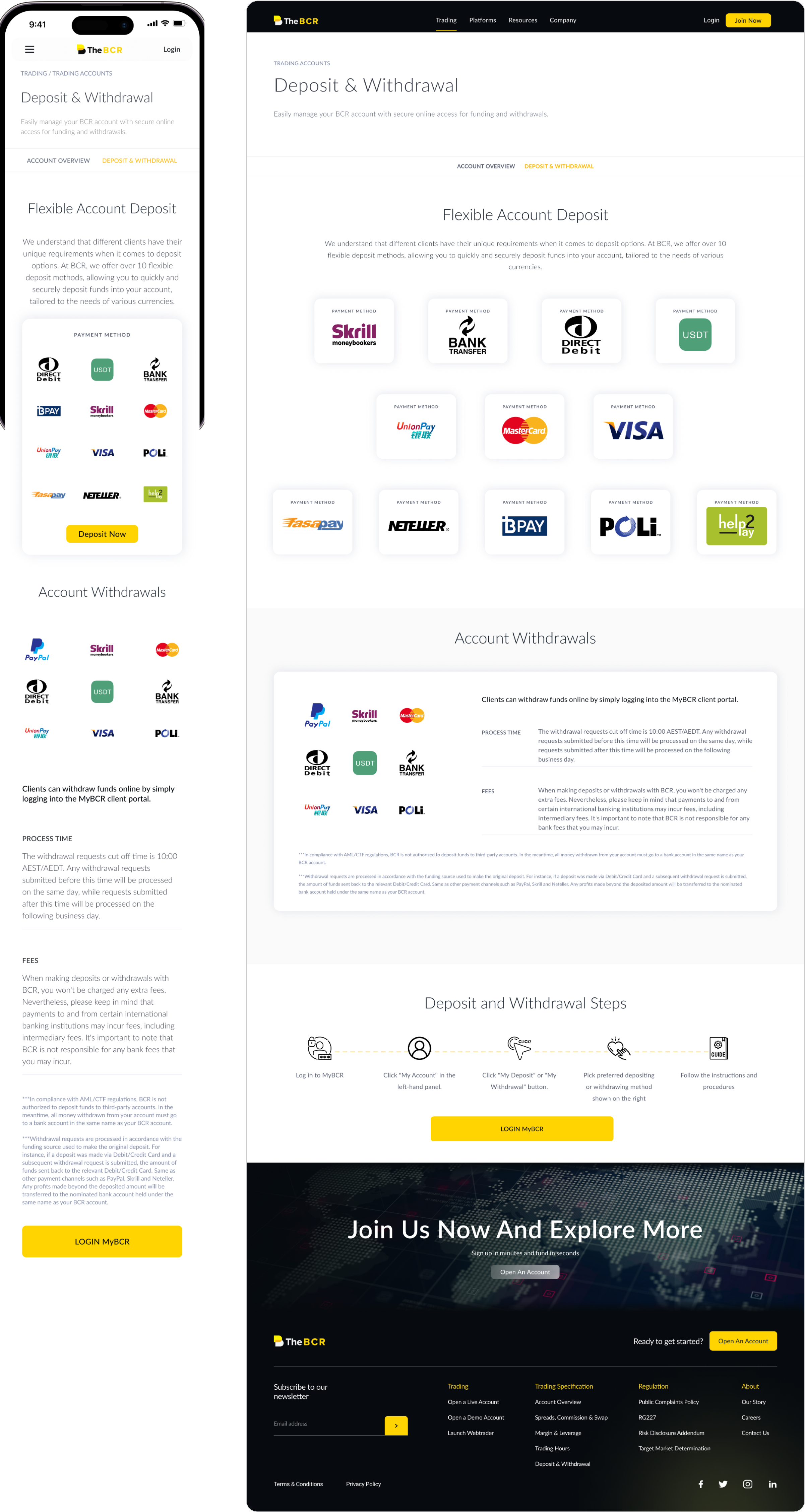
Solution
Final Presentation


-poster-00001.jpg)
-poster-00001.jpg)
Reflection
What I learned
Establishing a design system is indeed crucial at the beginning of a design project. A standardized set of design elements, color palettes, and layouts ensures brand consistency and significantly improves efficiency. As the sole web designer in this project, and as a recent graduate taking on my first real-world project, I faced challenges in the early stages due to the lack of a design system, resulting in wasted time and unnecessary detours.
Utilizing Figma's components effectively is crucial, especially for recurring elements like navigation bars and footers that appear on almost every page. Using components can significantly enhance efficiency. In particular, in real-world projects, design changes are common due to feedback from stakeholders. Components enable quick and consistent updates across all pages, saving time and maintaining design coherence.
Effective team collaboration is crucial in real-world projects. A real project involves various stakeholders, including feedback and requirements from upper management and technical considerations from frontend developers. These factors determine the feasibility of the design implementation. Regular communication with the team and timely improvements during the design process are essential to ensure project success and alignment with project goals.
Where to improve
For my own design, I hope to use figma's new features of variables and advanced prototypes to further refine the site's design system and interactions.
In the design world, there is no such thing as a perfect design. Even after a project has been implemented and recognized, continuous improvement and updates are necessary. Factors such as changes in company services, technological advancements, and user feedback can all contribute to the ongoing improvement of a website. It's important to embrace a growth mindset and be open to refining and enhancing the design based on evolving needs and insights.