Make Data Matter in Visual
Duration
Tools
Type
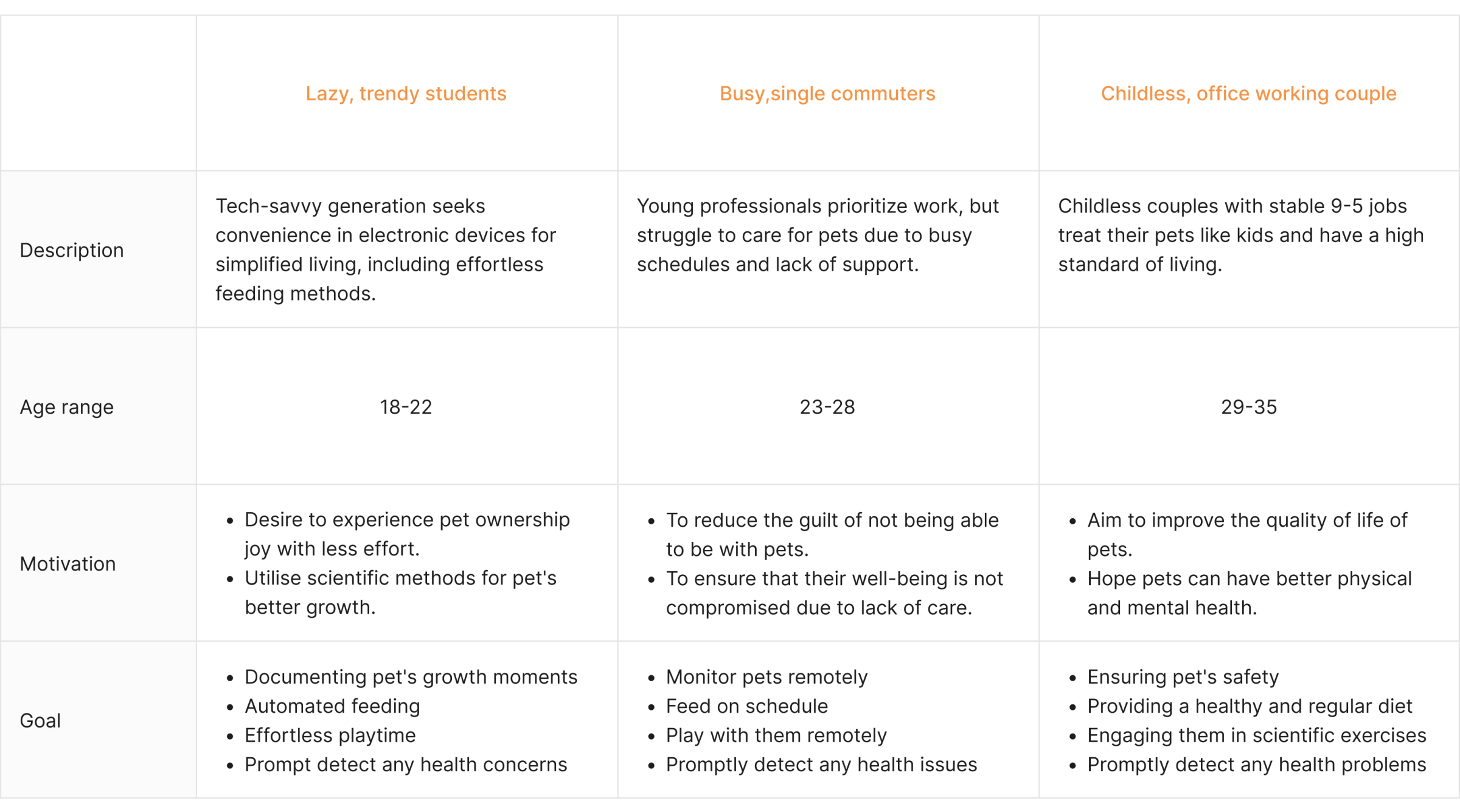
Role
Make Data Matter in Visual
Duration
Tools
Type
Role
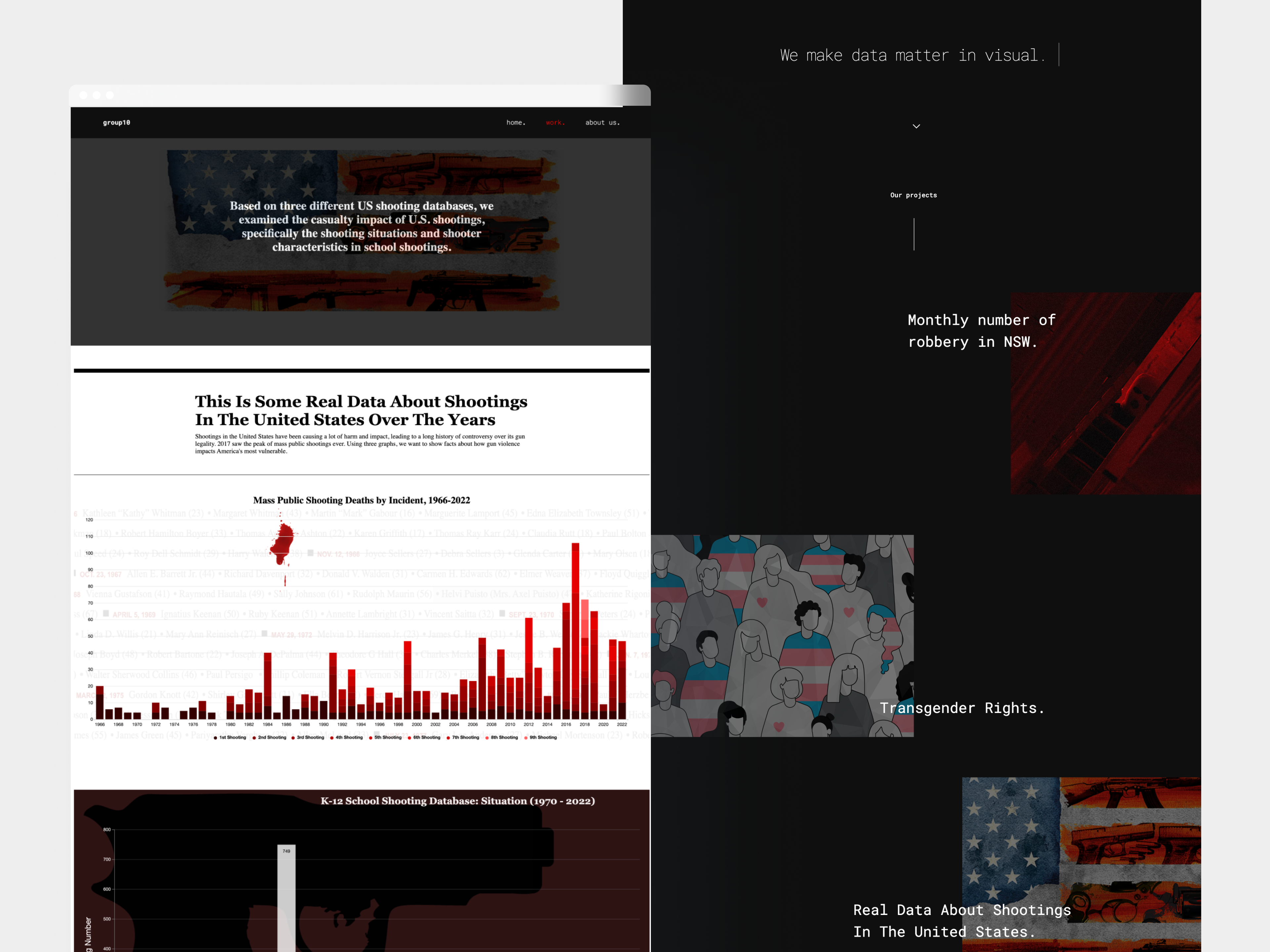
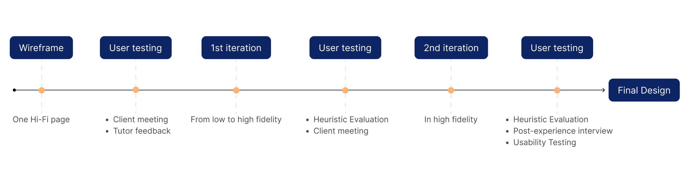
This project involved selecting , analyzing and visualizing data from BuzzFeedNews across three topics. Our goal was to convey these stories effectively through visual formats and showcase them within a portfolio website. In a collaborative effort, each team member crafted a distinct visualization. I also took on the role of integrating everything into the final portfolio website. Our work was nominated for Outstanding Graduation Project, demonstrating the ability to create impactful data-driven narratives.
Challenge
Our group used HMW to brainstorm and define the challenge.
- How might we select and analyze a compelling set of socially relevant data from BuzzFeedNews' extensive open-source dataset?
- How might we effectively employ visual design and data visualization to create user-friendly infographics that convey information comprehensively with minimal reliance on text?
Solution
To overcome these challenges, our team devised the following solutions through research, analysis of trending social issues, brainstorming, prototype design, and mutual evaluation:
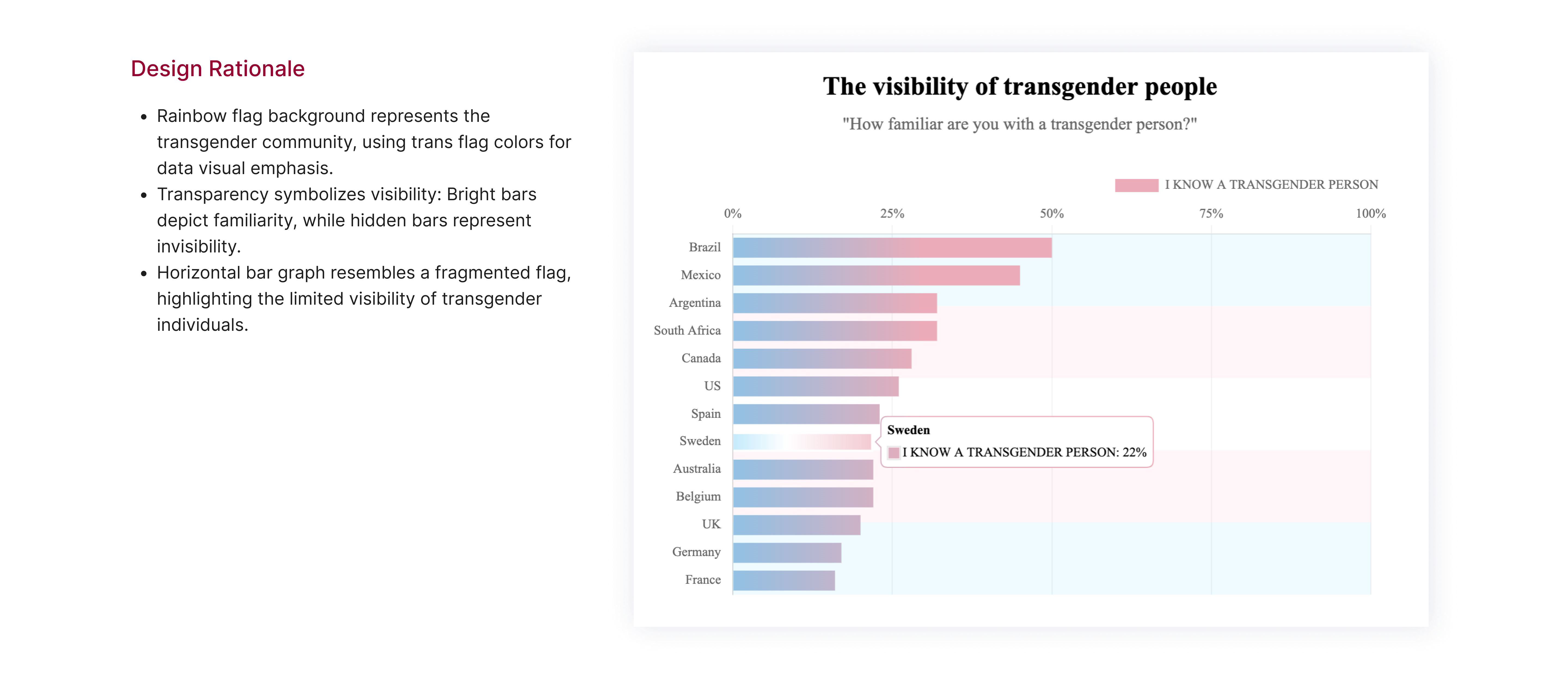
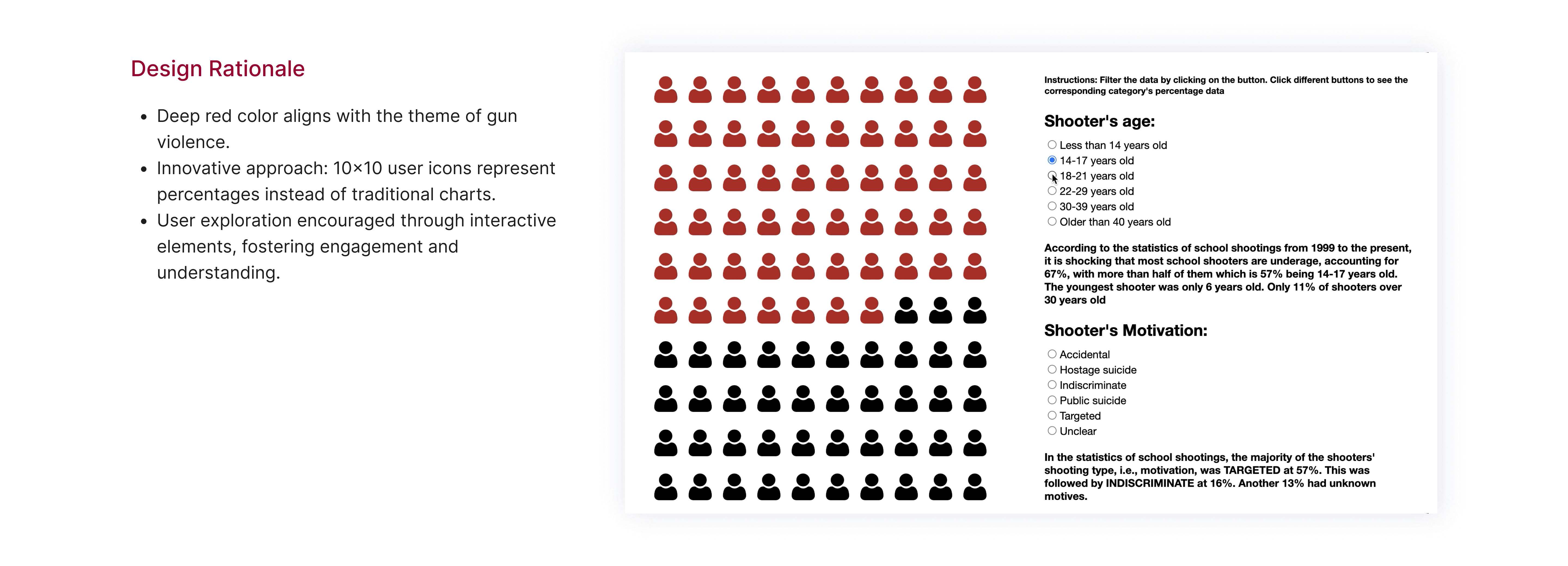
- Select widely discussed and high-impact social topics such as LGBTQ, gun violence, and human rights.
- Explore angles within these topics that are often overlooked or contain implicit issues.
- Ensure that the choice of visual design closely aligns with the topics and seamlessly integrates with the chart types.
- Enhance the user experience through interactive charts.
Discover
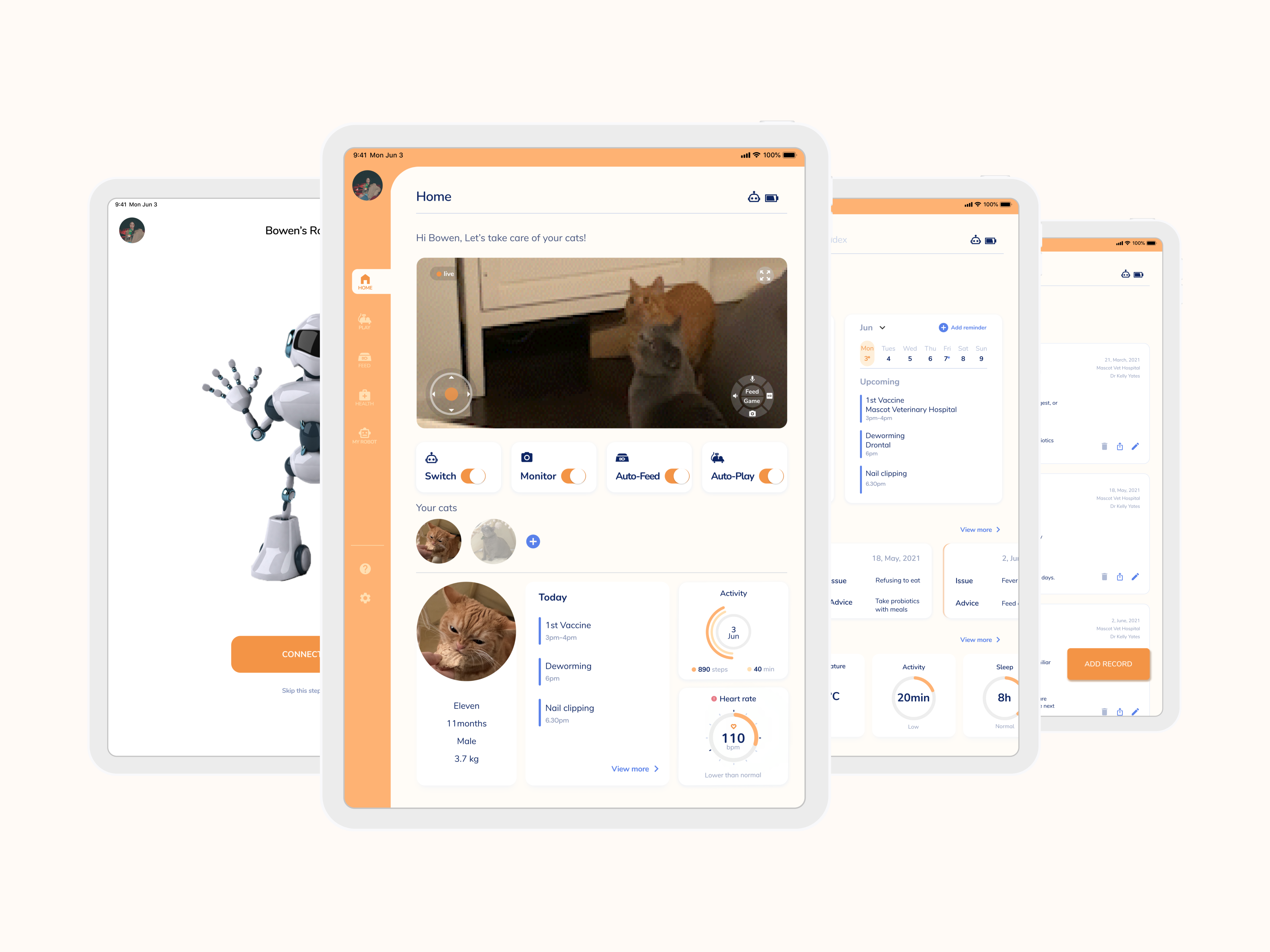
Pets keeping essentials
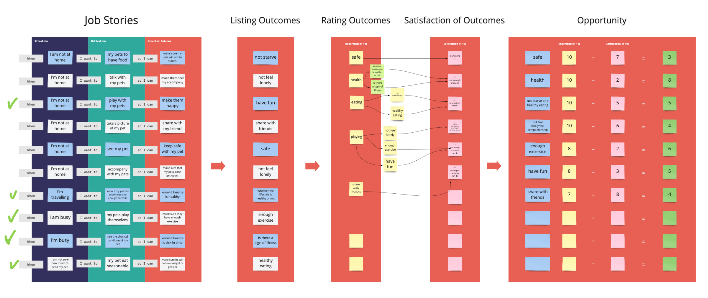
Define
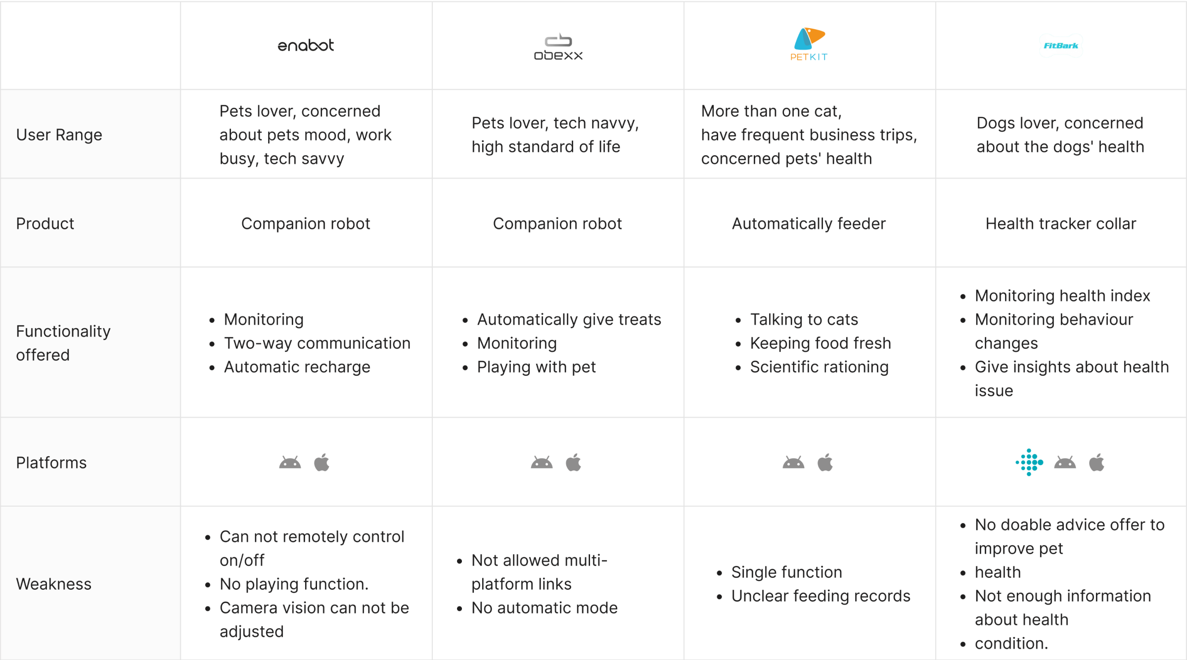
Carving out a niche in an emerging market


Ideate
Focus on the health function
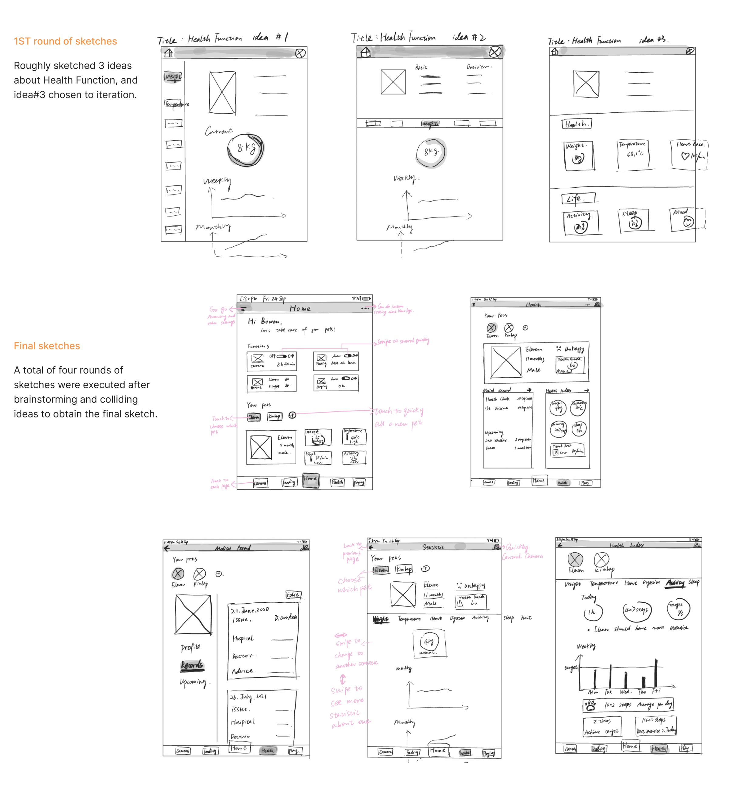
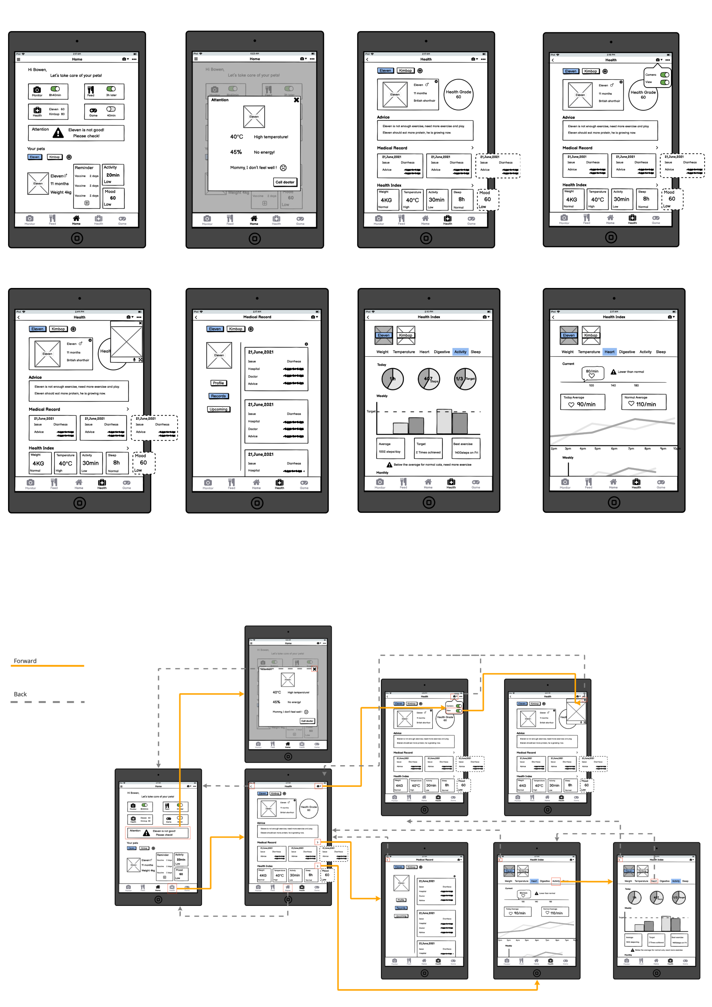
Test
Focus on the health function
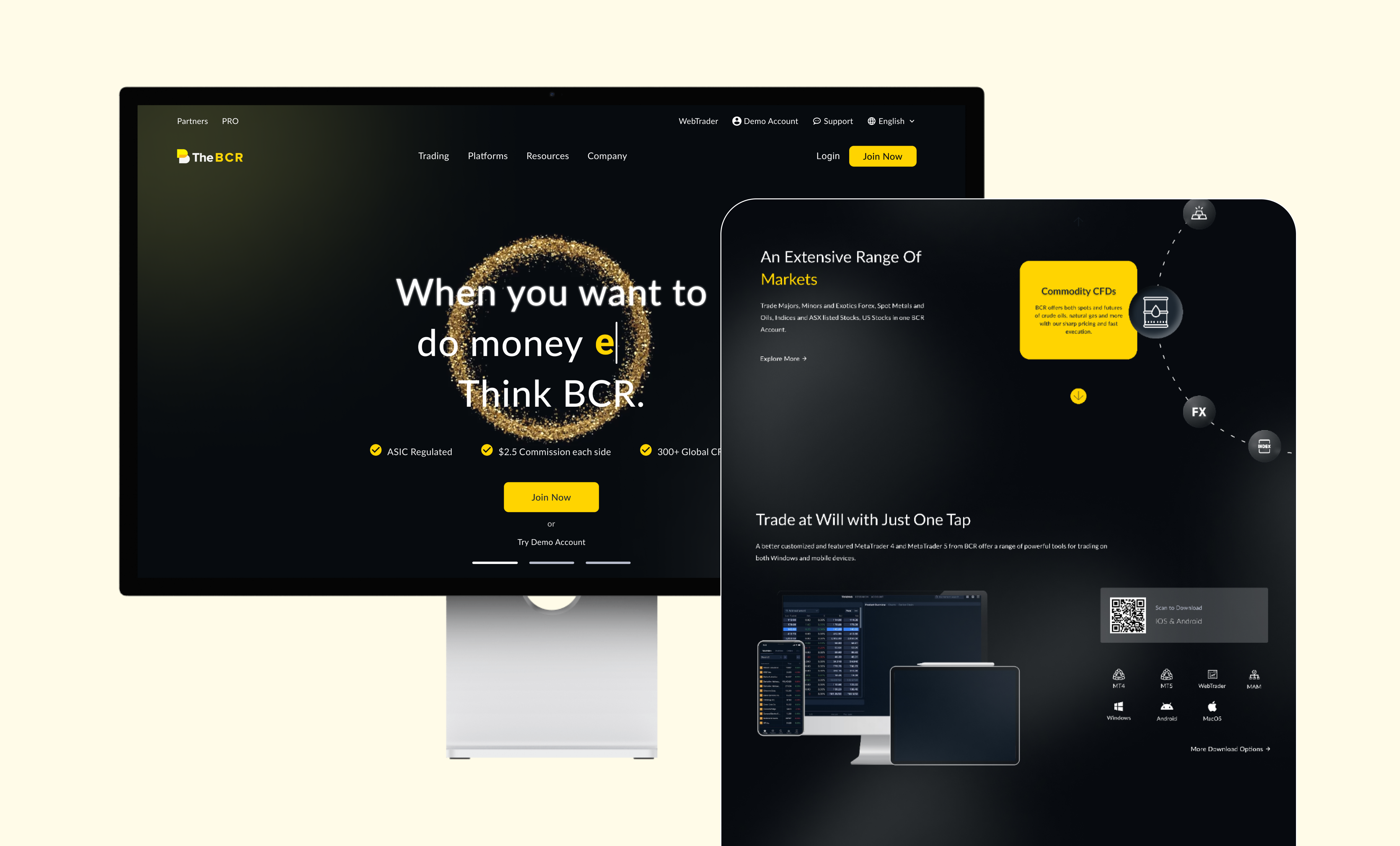
Showcase
Data Visualization Goes Beyond Charts
Solution
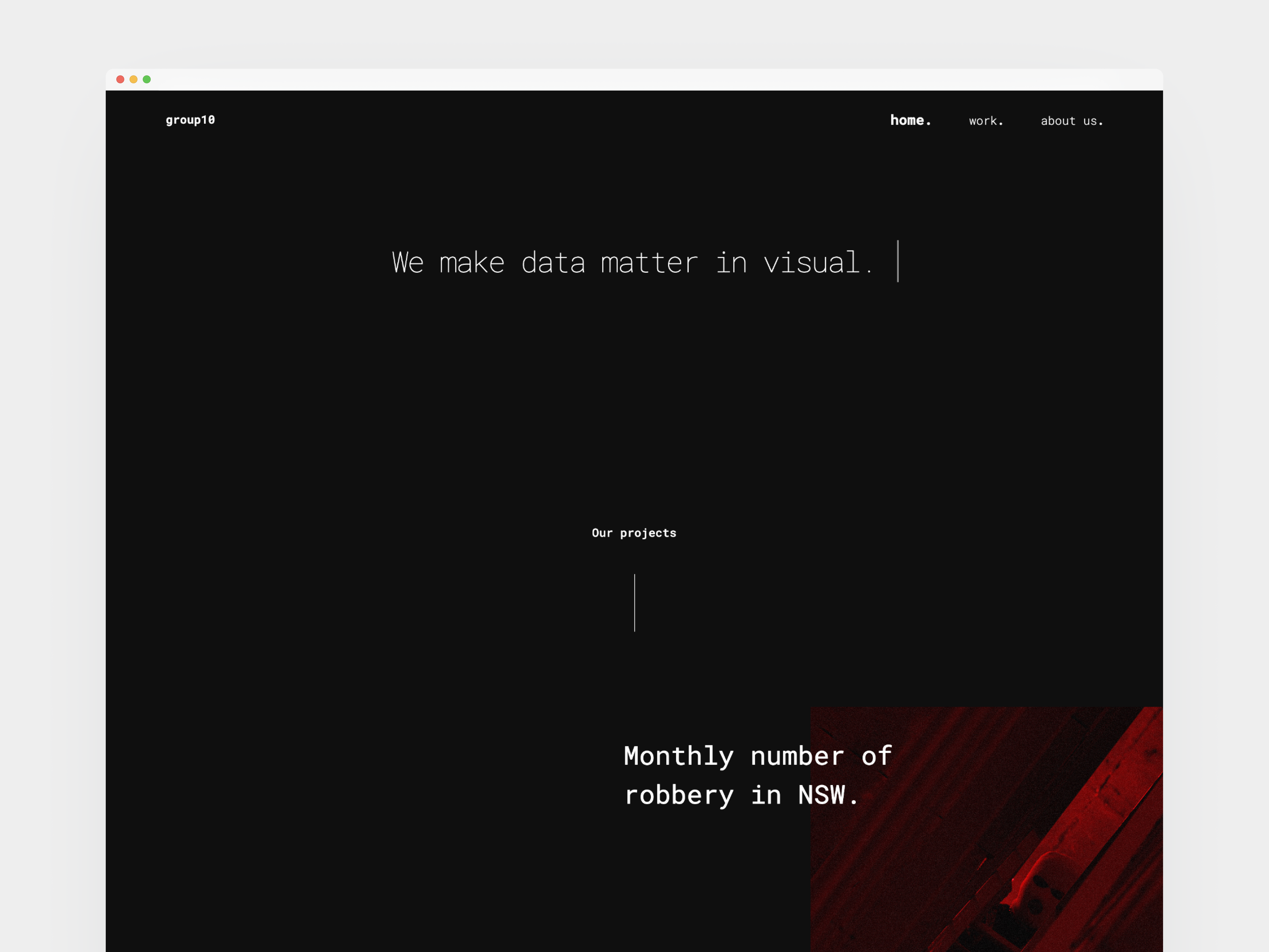
Final Portfolio Web


-poster-00001.jpg)
-poster-00001.jpg)
Reflection
What I learned
Through this project, I acquired front-end web development skills, learning how to bring designs to life through code rather than just being a visual designer using Figma. Coding was both challenging and captivating, with each bug encountered leading to the search for solutions and the satisfaction of successfully bringing my ideas to life.
Furthermore, I learned that data visualization goes beyond creating simple charts; it involves crafting visually compelling and storytelling-driven representations. Examples like "Parable of the Polygons" (https://ncase.me/polygons/) and "Chit Chart" (https://www.behance.net/gallery/87757735/Chit-Chart) inspired me, showcasing the potential for engaging data storytelling.
Where to improve
Learning from "Parable of the Polygons," I realized the power of interactive data visualization. Allowing users to play and explore different choices, and experience the consequences of their decisions, enables them to understand the profound implications conveyed by the data on a deeper level.